Flower´s new Design Language


It's finally here: Flower’s new design language!
Some of you might have noticed when visiting flower.ai that something has changed. We are excited to announce that we have finally completed the design overhaul for Flower!
The idea of creating a unified design language for Flower came about almost simultaneously with the first commit, back in February 2020. But before we dove into colours, shapes and fonts, we took a step back and asked ourselves: what is so special about Flower?
Federated Learning (FL) is quite a complex topic, especially for users new to the field. The goal of Flower is to make FL more approachable, even for users who are just getting started. Flower also plays well with other technologies on an architectural level, making it an open (some might even say friendly) framework. As these characteristics are fundamental principles in the development of Flower, they should also be reflected in the design language: Everybody should feel welcome, whether they are experts publishing at NeurIPS or just starting their federated learning journey. This is what defines Flower and its community:
Friendly, approachable, and open to everyone.
:)
Along with these three main attributes, we started the process of finding the right design language. What might sound easy to some readers, is actually a long iterative process with many rounds of feedback. First up was the question which colour would express the friendliness and approachability of Flower. Since “approachable” is an emotion which could also be described as friendly, we mainly focused on “ friendly”.
When looking at the psychology of colours, many colours can be excluded already. Red for example represents excitement, passion, and movement and is often used to create a sense of urgency. For example, a famous fast food chain with yellow and red colours uses the red to subconsciously influence the customers to order and leave the restaurant rather quickly. Although there are no Flower stores (yet), we surely don’t want to influence users to leave the website but instead take as much time as they need to dive into the topics they're interested in. The colour purple is another colour we excluded at the beginning, since it is associated with royalty, wisdom, and respect and is often used for beauty products. Blue was a difficult colour for us. It is a colour often used in tech and radiates peace, tranquillity and maturity. However, in the end it was not “friendly” enough for us, which led to its termination. Ultimately, we arrived at green and yellow/orange which immediately seemed to be good candidates, since both colours can be found a lot in nature and feel bright and friendly. We therefore based the first draft upon these colours.
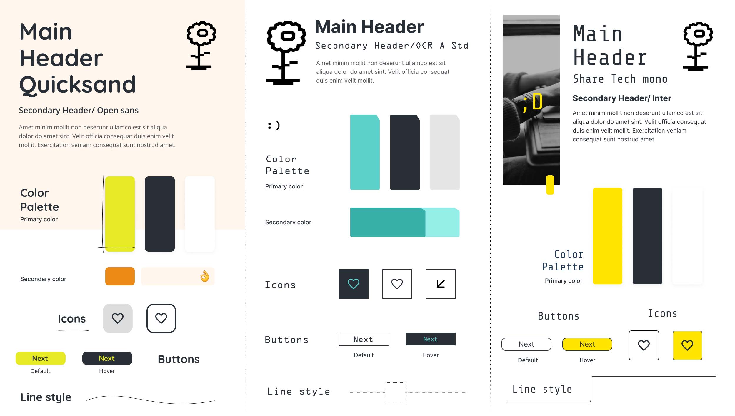
Again looking at the emotions of the colours, we can see that green represents nature, tranquillity, and wealth. However, it is mostly used for products with a very strong connection to nature. It is therefore not the best fit for an open source software framework such as Flower.
Yellow and orange, on the other hand, communicate the emotion of cheerfulness and optimism. It stimulates the logic centre of the brain and promotes enthusiasm, which seemed to be a perfect fit for Flower: software engineering is a field of intelligent people who are optimistic about building a better future and solving complex problems using software. In the end, we had to define the exact colour code(s) for the brand.
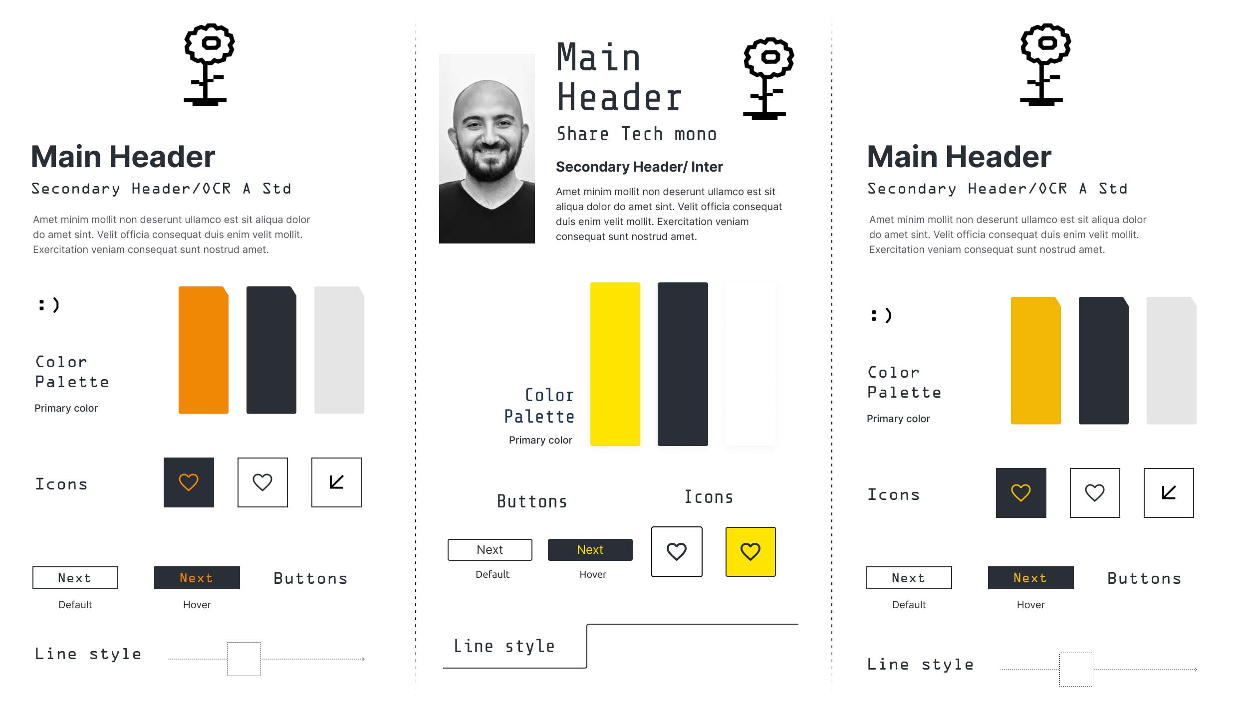
This was a great opportunity to involve colleagues and ask for their feedback. What emotions come up when seeing different shades of yellow, orange, and a mixture of both? This made us rule out a pure and strong orange as well as the simple yellow, since both colours were immediately linked to other companies. So in the end, we arrived at our final primary colour for Flower: Orange-Yellow. It directly creates a sunny and friendly environment which, we felt, is perfect for the framework.
Next up: fonts! So far the font for Flower was “Inter” by Google. But we wanted something with more connection to Flower, which is why we started looking at fonts that are more playful, such as Quicksand.
But when testing it in combination with the colours, the result actually felt… too playful! Which meant for us, we needed to find a different connection. This is when the idea came up to connect the font to what the framework is all about: beautiful code. Many development environments (IDEs) use monospace fonts, such as JetBrains Mono. So, we started comparing different monospace fonts and finally decided on Share Tech Mono. During this process, we noticed that large blocks of monospace text felt a bit overwhelming to read. Converting each and every text into the monospace only intensified the effect. We therefore decided to include another font for the main texts and some headlines, and only use Share Tech Mono for visual accents. Due to its good readability and neutral design, the choice fell on Montserrat.
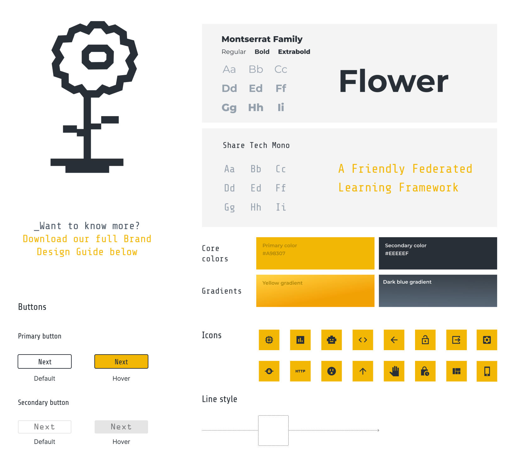
With this, the basic structure of the new design was set. The next step was to transform the colours, fonts, and Flower principles into a style for the website, visuals, and presentations. But why talk about these pure visual topics, rather than just show it? If we have captured your interest so far, head over to the Design Guide (PDF) and take a detailed look around!
Download Flower Design Guide here: Flower Design Guide